die Frequenz der Blog
Post Frequency by Month
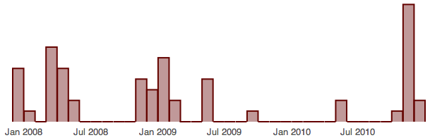
This nicely illustrates that my blogging attention span is kind of bursty. There is a cluster of posts during the first half of 2008, another one in the first half of 2009 and then a giant dead spot from the middle of 2009 until last month. It's actually kind of funny that pretty much all of my blog posts have been written in tree bursts of attention separated by big swaths of neglect.
Histogram of Post Frequency
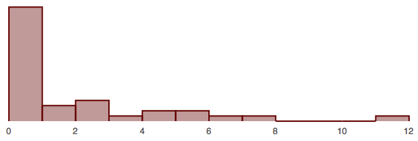
... and the runaway winner is zero! Mostly explained by the fact that there have been streches of five or six months where I haven't posted a single thing (like, for instance, the first half of 2010). November 2010 deserves special mention as it is a crazy outlier on the the complete other end of the scale with four more posts then then next most prolific month.
Making Tufte Proud
I used flot to generate the histograms and while it does a good job at producing nice looking graphs it has the annoying habit of adding lots of stuff to your plots which reduces the percentage of pixels in your plot that convey data (data ink). It took a surprising amount of fiddling to turn off all of the exta stuff, most of which was accomplished by setting the color of the grid lines and frame to white:
$.plot($("#plot"), [data], {
    bars: {show: true},
    grid: {
        backgroundColor: "#ffffff",
        borderColor: "#ffffff",
        tickColor: "#ffffff"
    },
    yaxis: { ticks: 0 }
});